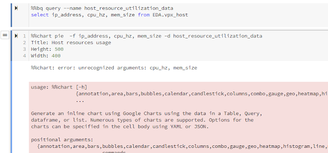
What good will it do if one can't visualize and picture the data? Visualizing the data can be achieved from BigQuery -Data Studio or Datalab - %%chart function. In this blog, I am going to try out visualizing the data with Datalab - %chart feature.
[Learned]
variables CANNOT have space in between. Otherwise, it would error out with "%%chart: error: unrecognized arguments: "
[Learned]
The Title, Height, Width should be "title", "height" and "width" respectively. It is case sensitive. Why didn't GCS provide better hints or indications on these? Submitted recommendation to GCP on this.
Charting with Pie
%%bq query --name host_resource_utilization_data
select ip_address, cpu_hz, mem_size from EDA.vpx_host
%%chart pie  -f ip_address,cpu_hz,mem_size -d host_resource_utilization_data
title: Host resources usage
height: 1000
width: 1000
Pie Chart with each IP with total resources used. Using SUM to group by.
%%bq query --name host_resource_by_ip_sum_data
select ip_address, sum(cpu_hz) as SUM_CPU, sum(mem_size) as SUM_MEMORY from EDA.vpx_host group  by ip_address
%%chart pie  -f ip_address,SUM_CPU,SUM_MEMORY -d host_resource_by_ip_sum_data
title: Host resources usage by IP address
height: 1000
width: 1000
Charting with line where the axis X represents IP address and the lines are CPU and Memory.
%%chart line -f ip_address,cpu_hz,mem_size -d host_resource_utilization_data
height: 300
Charting in Histogram but not very meaningful here.
%%bq query --name host_resource_by_ip_histogram_data
select ip_address,cpu_hz from EDA.vpx_host
%%chart histogram -f ip_address,cpu_hz -d host_resource_by_ip_histogram_data
title: Host Resources Usage in Pie Chart
height: 1000
width: 1000
Charting with Timelined.
Load vpx_vm.csv with extracted data with the following query to GCS Bucket
select vm_id, ds_id, updated_time from vpx_vm_ds_space;
%%gcs read --object 'gs://datalab-project-1-239921/vpx_vm.csv' --variable vpx_vm_data
Example of using panda and Dataframe.
import pandas as pd
from StringIO import StringIO
#create dataframe
vm_df = pd.read_csv(StringIO(vpx_vm_data))
date_summary=vm_df.groupby(['updated_time'],as_index=False)['vm_id'].sum()
print(date_summary.head())
date_summary['updated_time'] = pd.to_datetime(date_summary['updated_time'])
date_summary.dtypes
That is equivalent to the following query. Apparently, not very meaningful.
select sum(vm_id), updated_time from EDA.vpx_vm group by updated_time;
%%chart annotation --fields updated_time,vm_id --data date_summary
title: VM and Updated Time
height: 200


No comments:
Post a Comment